The most interesting of the bunch – thoughts?
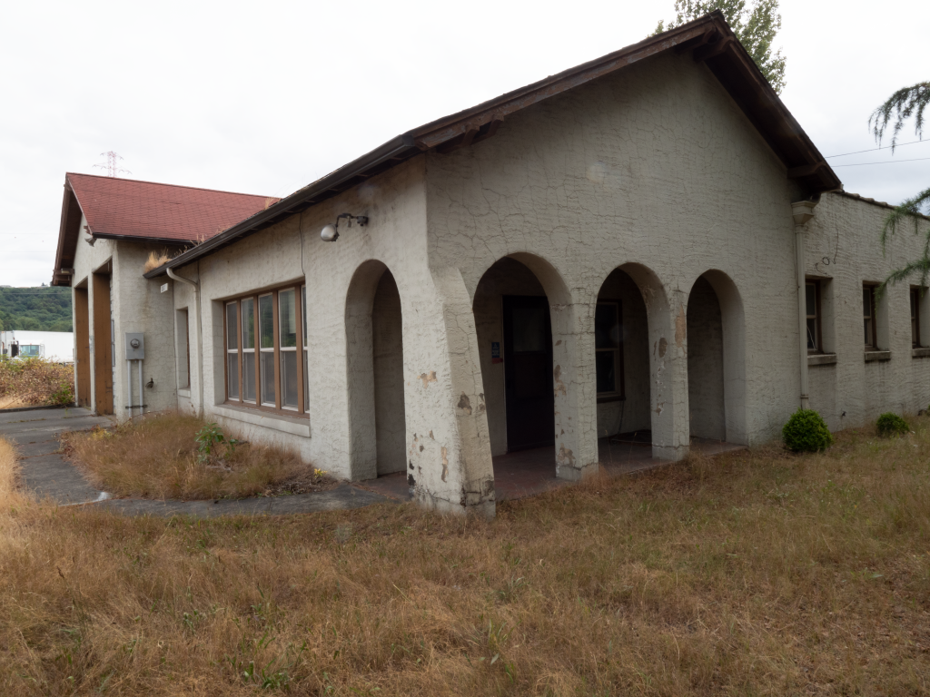
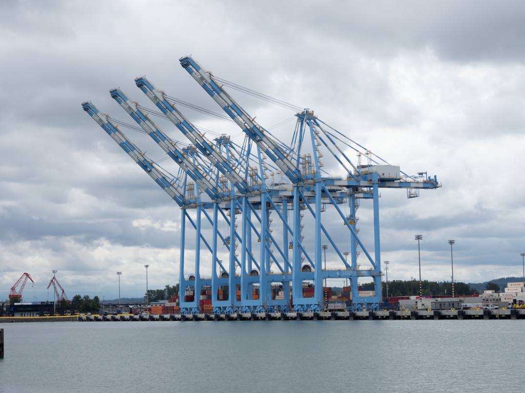
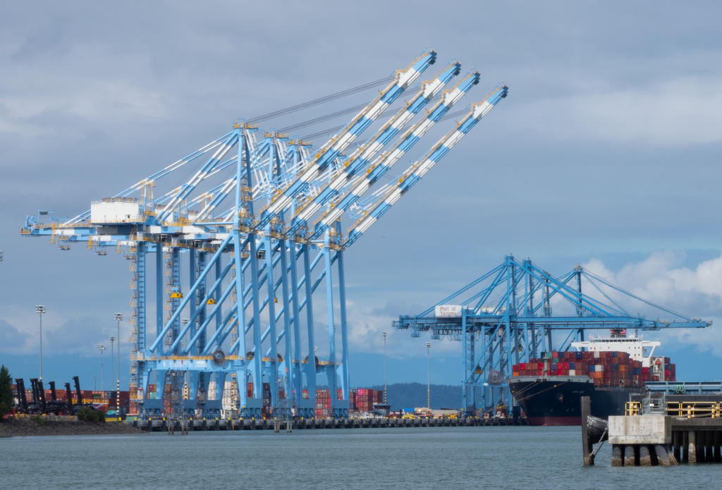
The most interesting of the bunch – thoughts?
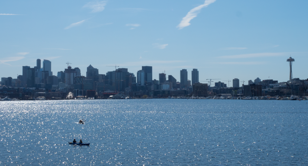
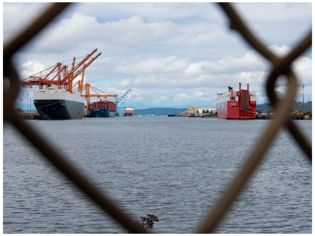
Is a day shooting pictures still a success when one gets nothing very usable? This was the best I got last Saturday. A sorta OK look at a backlit Seattle.
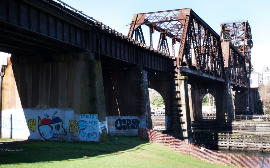
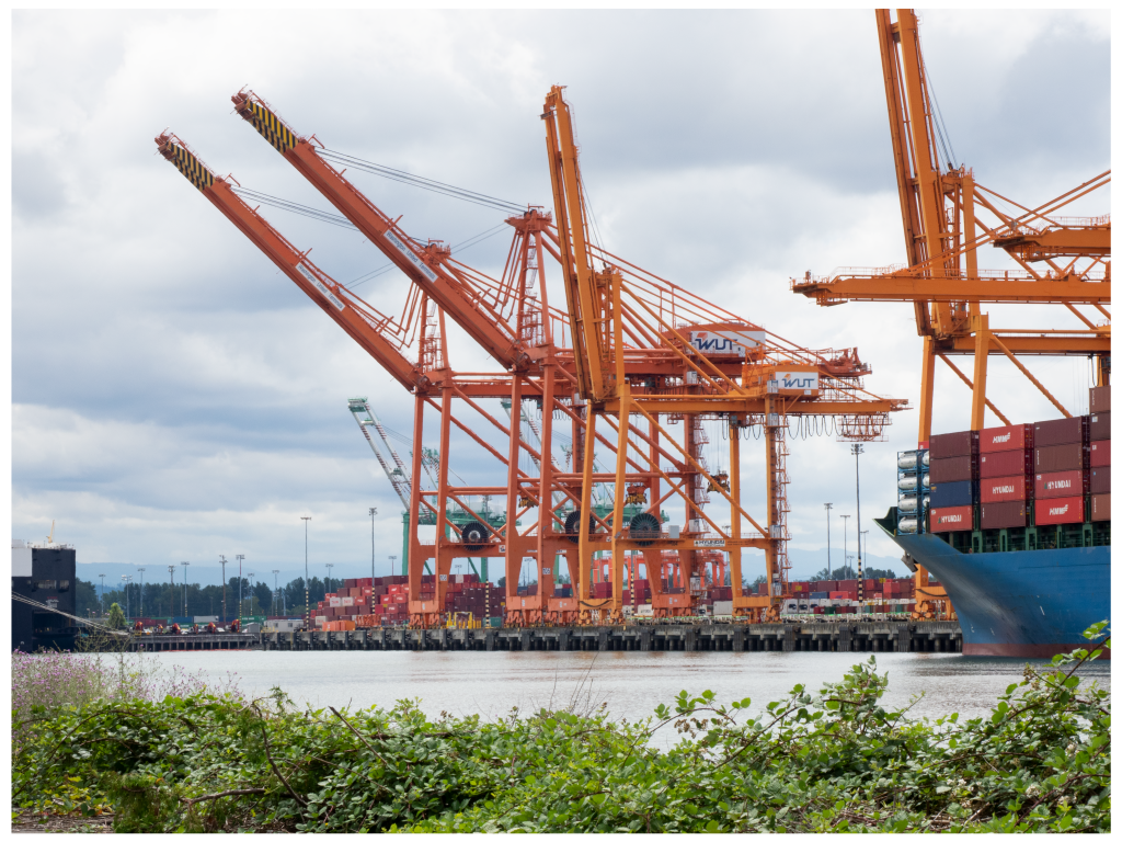
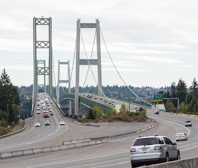
A different look at the trestle. I fund the structure interesting, but it seems to “overfill” the frame. I want to capture both how massive it is as well as how intricate it is and how it fits into the environment. Thoughts?
I copied this picture from the email Jim sent with this picture attached —
“I played a bit with the picture. This probably isn’t your vision. And I don’t have access to Silver FX on this PC, but I’m sorta liking it.
Jim”
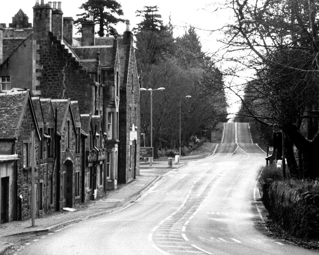
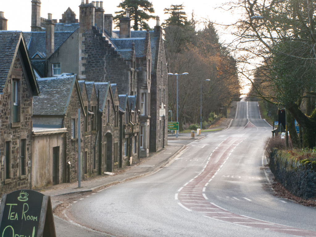
This does a good job of making the village and the buildings the focus of the story.
I have enjoyed exploring the possible stories this image can tell with both of you – Thanks!
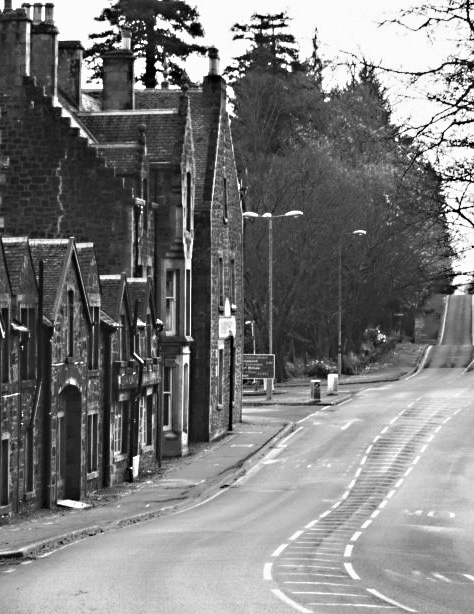
Just going to B&W doesn’t work for me. Two problems – firstly, the lack of sharpness which looks sort of hazy/moody/ethereal in color, just looks muddy in B&W. Secondly, there is not enough difference in contrast between the buildings and the foliage.
For me, the main story here is the road – a quiet stony village on a road to somewhere. So, as Jon suggested, I cropped the picture to bring the road more into the center of the picture, and removed the tea shoppe sign. I would like to have kept more of the curve at the bottom right, but I can’t do that and remove the sign.
It comes down to the story, as Jon suggests. There are two or three possible stories here. One is the village, which is the story we would get with Jim’s suggestion – which I think would work well. The second story is the suggestion of a good place to rest on a road trip or just a visit to the village, but the partial tea shoppe sign doesn’t carry the narrative very well. And the third story is the road.
I haven’t been getting out with my camera lately, so recently I went through almost all my pictures and selected the ones I liked the most. These are the ones that I see myself wanting to fix or alter as needed, and print to keep. These are two pictures I took in Scotland.
The Lagavulin picture is just an “I’ve been there!” shot.
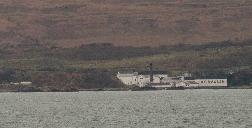
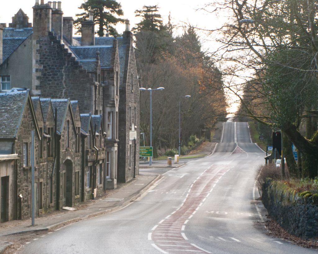
This other is the one I really like as it is so reminiscent of the look and feel of Scotland. What’s it do for you? Thoughts on how it might be improved?
Here’s a first try. If I feel motivated, I may try lightening the clouds a bit, but then the bridge towers (especially the gray ones) will look unnaturally dark for the brighter sky.
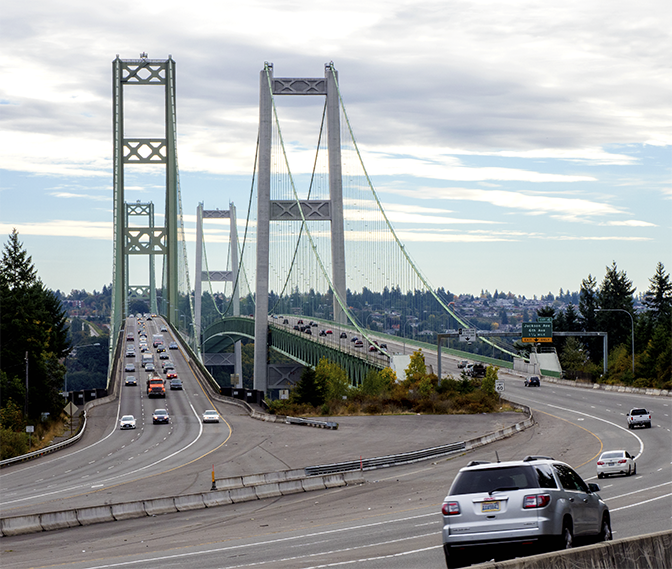
I like the composition here, but the light was so blah. I can probably photoshop the lighting to bring life to the picture – is it worth the effort? I would need a brighter/bluer sky, and more saturated and vibrant colors on the bridge and the cars. …and maybe a little dehazing in the background.
Hi Guys! Barbara got this photo taken on an iPhone 6 from her son. She would like to print and frame it, but I am not sure I can do much to make it better. It looks fuzzy to me, and noisy, and I’m not sure why. ….or what I can do about it. I have tried to change its clarity, but an improvement in one bit results in bad effects in another bit. I tried to work with it both in Camera Raw and Photoshop, changing the clarity or using a sharpening filter, and it never looks better.
Ideas?