Jim’s Email

Posted on

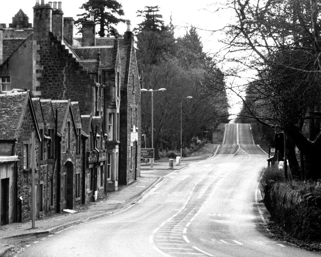
I copied this picture from the email Jim sent with this picture attached —

“I played a bit with the picture.  This probably isn’t your vision.  And I don’t have access to Silver FX on this PC, but I’m sorta liking it.

Jim”

This does a good job of making the village and the buildings the focus of the story.

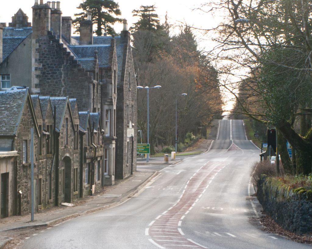
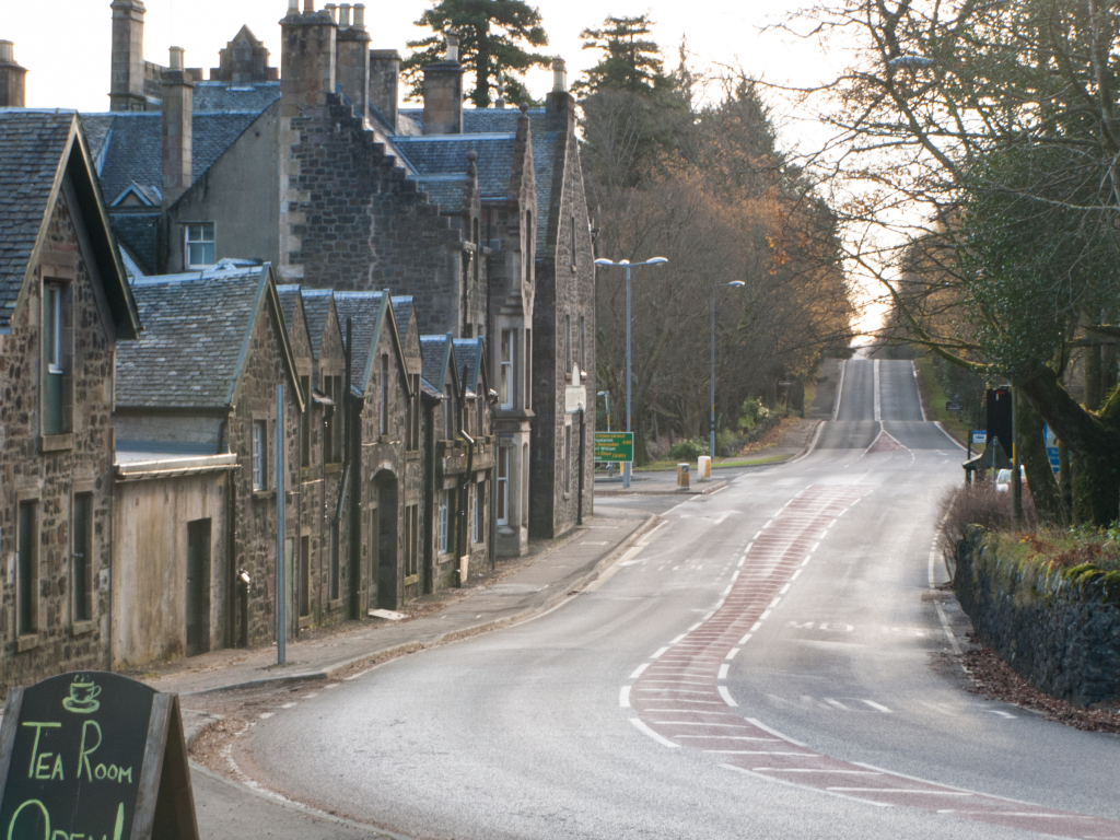
I have enjoyed exploring the possible stories this image can tell with both of you – Thanks!

B&W

Posted on

Just going to B&W doesn’t work for me. Two problems – firstly, the lack of sharpness which looks sort of hazy/moody/ethereal in color, just looks muddy in B&W. Secondly, there is not enough difference in contrast between the buildings and the foliage.

On the Road

Posted on

For me, the main story here is the road – a quiet stony village on a road to somewhere. So, as Jon suggested, I cropped the picture to bring the road more into the center of the picture, and removed the tea shoppe sign. I would like to have kept more of the curve at the bottom right, but I can’t do that and remove the sign.

It comes down to the story, as Jon suggests. There are two or three possible stories here. One is the village, which is the story we would get with Jim’s suggestion – which I think would work well. The second story is the suggestion of a good place to rest on a road trip or just a visit to the village, but the partial tea shoppe sign doesn’t carry the narrative very well. And the third story is the road.

Pics from the Past

Posted on

I haven’t been getting out with my camera lately, so recently I went through almost all my pictures and selected the ones I liked the most. These are the ones that I see myself wanting to fix or alter as needed, and print to keep. These are two pictures I took in Scotland.

The Lagavulin picture is just an “I’ve been there!” shot.


This other is the one I really like as it is so reminiscent of the look and feel of Scotland. What’s it do for you? Thoughts on how it might be improved?