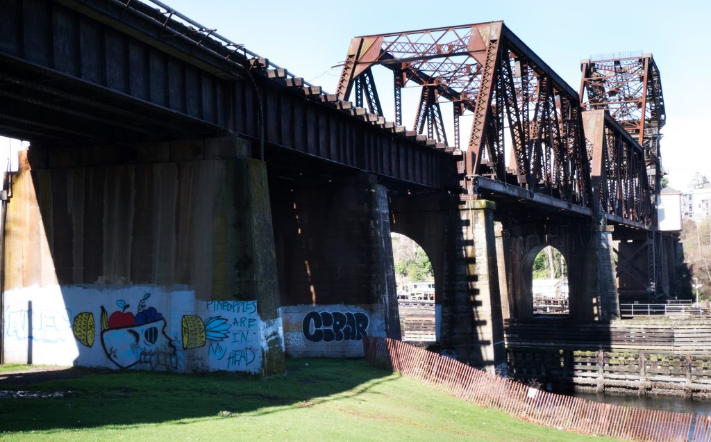
A different look at the trestle. I fund the structure interesting, but it seems to “overfill” the frame. I want to capture both how massive it is as well as how intricate it is and how it fits into the environment. Thoughts?
A different look at the trestle. I fund the structure interesting, but it seems to “overfill” the frame. I want to capture both how massive it is as well as how intricate it is and how it fits into the environment. Thoughts?
The graffiti detracts from the more complex structure. It pulls the eye in first. Also the flat part of the bridge has about 60% of the screen. It’s a complex and difficult structure because of it’s lack of balance and feels out of place with its surroundings. And that’s what I took away being there!
I like the angle of this, Joel, and the way the trestle seems to climb up into the sky! I’m not sure that it “fits into” the environment rather than dominating it, though! The fence does help give it a sense of scale, but I think the impact would be more immediate if there was a person in the image as well. I’d crop out the left side, too, probably up to where the bridge deck meets the top edge of the frame; that splash of sunlight on the left tends to pull my attention away from the bridge. I don’t think the bridge overfills the frame; your intent was to show how massive it is, and you’ve definitely achieved that.